Tuesday, May 10, 2016

Exploring Data Visualization

I spent this quarter looking at various ways to make data analysis more complex, going past pie charts and bar graphs, but also more accessible to the average user, by presenting and organizing it in a more visually intuitive way. The two main data sets I used for this exploration are: 1) A personal, mid-size data set. Every day in 2015, I rated how I felt about that day from 0-100 (though my numbers ended up being 40-70). 2) A very large set of survey answers collected from 15,000+ high school students across the nation, including questions on health, video games and television, online behavior, and bullying. Using these two data sets, I examined the usefulness of 5 different, freely accessible data analysis services: Plotly Free, Tableau Public, Google Sheets/Charts, Datacopia, and IBM Watson.

Plotly Free (3/10)

Ease of Use: Convoluted (2/10)
Learning Curve: Intuitive (7/10) when graphing, Steep (4/10) when navigating around the site
Visuals: Decent (7/10)
Customization and Versatility: Decent (6/10)
Privacy: Allows 2 private projects before requiring public publishing (4/10)
Key Features and Recommended Usage: Accessible and editable online, open-source, programmer APIs, inexpensive pro version

Plotly seems like a good all-purpose candidate in theory—and, to be fair, some friends have had good experiences with Plotly. However, I spent most of my time with Plotly waiting on endless loading screens, wondering if something was loading or not when I clicked something, and attempting to figure out the mechanics and layout of things. About the privacy score: while I don't mind having a limit on private projects in the free version of a service, I don't appreciate having pop-ups when I exceed the limit, imploring me to upgrade to Plotly Pro. When I was actually organizing data, I found Plotly to be almost pleasant. But if my experience of frustration would be similar to anyone else's, I
cannot recommend using Plotly.

Tableau Public (9/10)

Ease of Use: Smooth (9/10)
Learning Curve: Somewhat difficult (5/10)
Visuals: Excellent (9/10)
Customization and Versatility: Good (8/10)
Privacy: All projects are saved to a public account (6/10)
Key Features and Recommended Usage: Program/application, box-and-whisker plots (I cannot express how much I love Tableau's box-and-whisker plots)

I spent most of my time with Tableau Public, and if you really want to explore a variety of analysis perspectives, Tableau is good for the job; it offers many chart types in a selection box that are choosable once the data is in. Because Tableau won't just analyze data on its own, only graph, you need to know what you want and what you're doing with the data. The interface is drag-and-drop into a multitude of work areas, which means it's easy to look at, but some of it gets lost in "what does this do?" It is all explained in Tableau's comprehensive how-to videos, but many casual users won't have the time to watch them all.
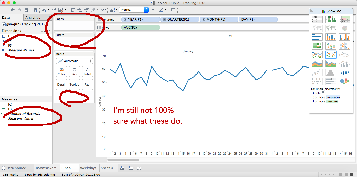


You can find the rest of the charts that I created with Tableau here.

Google Sheets/Charts (7/10)

Ease of Use: Smooth (9/10)
Learning Curve: Simple (9/10)
Visuals: Basic (5/10)
Customization and Versatility: Basic (5/10)
Privacy: Depends on your opinion of Google. For me, Trusted (8/10)
Key Features and Recommended Usage: Online cloud access, live data, easily shared

The chart and graph maker in Google Sheets is basic but definitely intuitive to use. Most everyone I know has had some experience with it; simply put your data into a spreadsheet, select it, and hit Graph. The little widget that comes up also offers some likely graphs that you might want. I find that Google Sheets gets the job done, but is very limited in aesthetic customization.


Datacopia (6/10)

Ease of Use: Simple (8/10)
Learning Curve: Simple (10/10)
Visuals: Basic, Colorful (6/10)
Customization and Versatility: None (1/10)
Privacy: Private (10/10)
Key Features and Recommended Usage: Simple

Datacopia is even easier to use than Google Sheets, a feat I find impressive in itself. However, it sacrifices customization for that ease. Once you upload your data, Datacopia generates a large (and I mean large. 100 or so) set of premade charts and you can pick one. The graphics are appealing, but if what you want isn't on there, you're out of luck. I generally would not recommend this for all but the simplest projects. One good note is that it promises that the data you upload does not leave your computer—completely private, if that's a must-have for you.


Watson IBM (7/10)

Ease of Use: Decent (6/10)
Learning Curve: Difficult (5/10)
Visuals: Decent, lacking in customization (6/10)
Customization and Versatility: Fair (5/10)
Privacy: Private Cloud Account (9/10)
Key Features and Recommended Usage: Handles big data well, business-oriented analytics, offered data insights

Watson IBM Data Analytics looks like a fantastic service for those doing heavy lifting with their data. It offers a variety of chart types. The best thing about Watson is probably its Exploration—an AI screens your data and suggests questions that might be answered by correlations it finds. Watson can detect gaps in your data—missing information that may compromise the quality. It can also take the correlations it finds and attempt to detect the why: which factors affect each other. Combined, it makes a powerful tool. However, I found it lacking in aesthetic customization, being unable to change the individual color, only pick from preset palettes. For casual users, it may also be hard to navigate the interface.


Tuesday, April 19, 2016


A tutorial for the iOS GarageBand app.  Video created to showcase Garageband's functions and how they can be used for educational purposes.

I used QuickTime to create this video.  I was able to connect the iPad mini to the Mac computer and record the screen using QuickTime.  I eventually used Windows Movie Maker for the finishing touches.  Enjoy!

Monday, March 21, 2016

Instagrok Tutorial

INSTAGROK PROJECT
Wouldn’t it be nice if you could look up information and not have to read through tons of different sites? Well then Instagrok is the thing for you. Instagrok is a website application that pulls content into a visual graphic.  
Watch my demo video on youtube
INSTAGROK TUTORIAL
Step 1: To get started go to...
nyanya.png
Step 2: Create an account (optional but recommended)
what.png
Step 3: Create your first Grok
HAH.png
Step 4: Refine it and explore the information
  1. This is what happens after you search a topic. Different items show up depending on your search. This one has to do with John Brown’s Raid on Harpers Ferry.  
Screen Shot 2016-02-26 at 8.54.31 AM.png


B) Each time you press one of the topics more appear that stem off of that one topic
boom.png
C)
nya.png


COMPARISON
Google
VS.
Instagrok
Gives you valid information
Gives you information from different places
Has reading level filter

Similarities
Gives valid information
Gives you information from different places
Has reading level filter
Gives you a list of all different sites
Gives a lot of info but doesn’t tie content together

Differences
Gathers information and puts it into one thing
Organized to give you more information at once
Allows you to make and annotate notes
Visually more pleasing


Friday, February 26, 2016

PowerPoint Photo Editing Tools

by Lauren F

When presenting to large groups of people you need to spice your slides up. With the new photo editing tools people can add fun new filters to photos and make mosaic collages. You can simply just drag and drop photos into a slide and make the edits right in the slides. Its a powerful and easy way to improve your photo editing skills without having to use paint. Watch the tutorial Lauren prepared with PowerPoint, Mix and iMovie and then explore the Photo tools to see what you can create.


Tuesday, February 23, 2016

On Using Teamup

Teamup is a free-to-use calendar schedule service that I found myself really liking. Its unique features make it stand out from other services like Google Calendar, iCalendar, and phone calendars. First, it requires no account- instead, the user keeps a link (it's a little long to remember, but it can easily be shortened with a service like bit.ly). For recovery, the calendar's creator can optionally input an email. The free version allows you to keep 10 subcalendars, color-coded categories in which events are put.

I think where Teamup really shines is its sharing system. The calendar's "administrator" can create multiple access links with different permissions. Here are all the different options:

On top of these options, you can apply these to either a whole calendar or just subcalendars. For each category, Teamup generates a new link that gives the person a different access level. You can then share these different links to different people, giving people exactly the access type you want.

After playing with Teamup for some time, here are some things that I liked and disliked about what Teamup can offer:

PRO: Browser based, iOS app
CON: Limited Android support; must be accessed from mobile browser
PRO: Still in development; new features on the way
CON: Still in development; not fully featured with importing and exporting other calendar types
PRO: Support for complex recurring events (biweekly, one-time adjustments, etc.)
CON: Free version only keeps 1 year of calendar history
PRO: Link and sharing system doesn't require everyone to make accounts
CON: Have to keep links around somewhere to keep using calendar
PRO: Free to use!
CON: Plus and Premium plans, for more features, are costly
PRO: Highly customizable visually and technically
PRO: Support team; I received an email back within 2 days

I think Teamup has lots of potential for different situations. For example, a teacher might keep this calendar around, put each of their classes on a subcalendar, and then give their classes access to the plan via a shared link. Event planners might use the scheduling view to see what happens when and who is where. Or a busy and forgetful student like me might keep it around, just to remember where he's supposed to be! I highly recommend Teamup as an all-purpose group scheduler.

Wednesday, January 6, 2016

Do Ink Green Screen Tutorial

There has been many new additions to Rockets a Help Desk this year, one of which is a new green screen. To go along with the green screen, we searched for some new software to accompany the wall. In this post, read about how RHD made this new addition, as well as how we are using the Do Ink green screen app to make projects.


Our Green Screen:
Since September, Rockets Help Desk has been wanting to add a green screen wall to our space in the library. We sectioned off a part of the wall next to the white board and brought in green paint to paint the wall. It only took one class period, a little spackle, two coats of paint and voila! Rockets Help Desk now has a green screen!


Utilizing the Green Screen:
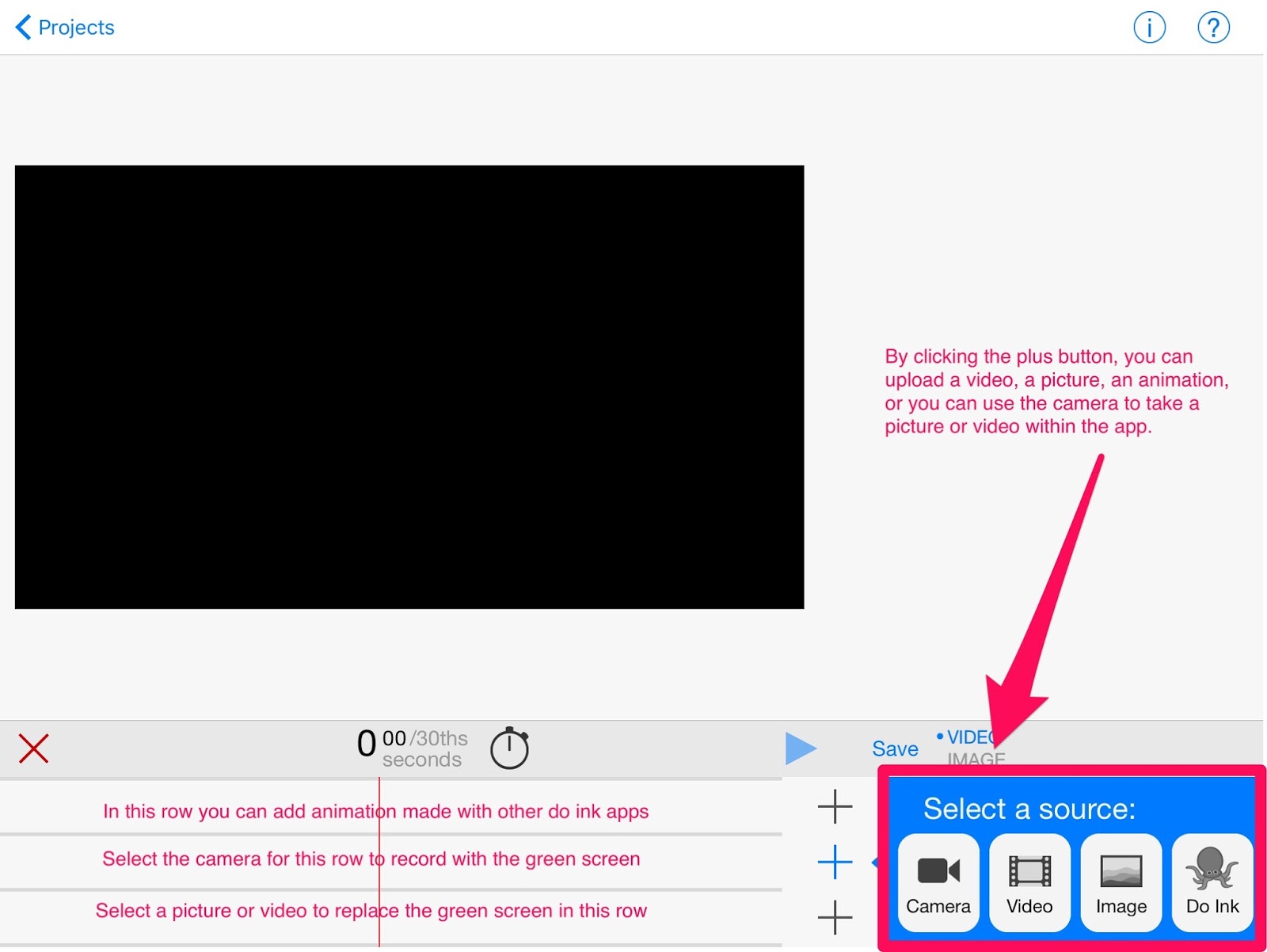
To work in collaboration with our new green screen, we decided to try out the Do Ink Green Screen app. This app costs $2.99 and allows you to input a video or image in the place of the green screen and record over it. Also, with the purchase of the Do Ink Animation and Drawing App, you can create little animations that can fly around on your video.


Maneuvering the Do Ink App:
When you open the app for the first time, there is a tutorial video that shows you all the different things you can do and how to include them in your project. While helpful, to fully understand the app and how it works, it is best to start playing around with it. Below I have included an annotated screenshot that includes the basics on how to get started.


App in Action:
With a green screen, the possibilities are endless. You can transport yourself to distant lands, make yourself a part of an already existing video, and transform the space around you into a fancy office building, a volcano- whatever you like.


In the video below, I’ll show you how I transformed our space in the library into a news studio.


Monday, December 21, 2015

Mindomo

Mindomo


A quick how-to on making an account and making a web with the website/ app Mindomo.
http://prezi.com/kpol0larar9c/?utm_campaign=share&utm_medium=copy


final full map.JPG
mindomo.com.png


create an account.png
your account.png


creating a map.png
mapping.png


subtopics slide.png
building your map.png


formatting your map.png
creating connections.png


reationships slide.png

finished map slide.png

Tuesday, November 24, 2015

On Making A Google Site of Your Own

    The overhaul of the wiki is complete, for the most part! On this project, I learned a lot about what goes into making a Google Site. Below I've described what some of the major pitfalls and conundrums of customization were for me, and explain a bit on the how-to's of Google Sites.

(As an alternative to reading this post, I've made a short video tutorial that covers much of the same material that I talk about:)


PART I: THE HEADER
THE HEADER.
    This is what the header looks like now. When I started, the site was all white for the background, which I think can be somewhat harsh on the eyes, particularly when reading small black font. To remedy it, I grayed out a lot of things, but not enough that it would start to melt in with the darker reds that I was promoting in the color scheme. I messed around with fonts and colors a lot. The horizontal navigation (as Google calls it) that you see used to just be a small row of links that were usually just skipped over by the eyes in favor of the sidebar. Well, I hate sidebars. So I spruced up the top a bit, and trashed the sidebar. To change the way the horizontal navigation is viewed, go to the gear icon > Edit Site Layout, and then select the horizontal navigation area (make sure that it's enabled first). The options for viewing it are Tabs, Boxes, and Links. I went with tabs because it felt like a more intuitive way to view the site.
    I have also discovered the Holy Grail of website navigation: hover-activated dropdown menus. This is particularly useful for The Team, because we can use the dropdown to access our pages easily. Before, I had to scroll down to either my own name or to the bottom, where the subpages are all listed, in order to reach my page and assignments. Instead, I can now just click the link at the top. To make a dropdown in horizontal navigation, go to the same place as for making Tabs, Boxes, or Links, and add a page to the display, use the little arrow icons to move it to right under the parent tab, and hit the right arrow icon to indent it. This will put it under the dropdown.
DROPDOWN MENUS. I'M CRYING FROM RELIEF.

    A bit of a last minute change here, after receiving input from other wiki users: We have a few tabs that are just obsolete- like the To-Do and Files tabs. Nobody seems to even think about going near them, and we have other ways of checking on that anyways. If it's unnecessary and takes up space, lose it. Drop it like it's hot. Those tabs have now been erased from existence. We will mourn their loss. (On the inside, anyways.)
PART II: THE BODY
The Team subpage
    In particular, I focused on the subpage titled The Team, because that's what a lot of us usually are on the wiki for. The Team Page is how we access our assignments (via Mrs. Dee's page) and post them (via our own pages). One thing that I added is a lifesaver for those on mobile and can't access the dropdown: the Navigation for Team Members.  Rather than insert everyone's name and link their page one by one, I used a gadget that is built in to Google Sites, called a Subpage Listing. Because we all have our pages as subpages of The Team, it works out perfectly. To insert one of your own, go to edit the page and hit Insert > Subpage Listing, under Common. I limited the settings on this one to only list subpages 1 level below, but if you want more, you can set that and allow a whole cascading tree of subpage links.
    One thing you want to make sure of when you take on a project like this, is to test it on multiple screen sizes and devices. Before, the only thing that separated each person on the page was a bunch of line breaks in between. On larger screens, this wasn't enough, and some of the pictures and member bios started to overlap. To fix it, I put in horizontal lines between each member, which prevents anything like this from happening. To insert the lines, edit the page and go to Insert > Horizontal Line, under Common.

PART III: BEHIND THE SCENES
The Settings Menu
    So to do all of this stuff that I've been talking about, you need to reach the menu I've shown above. Everything I've done can be accessed through two of the options: "Edit site layout" and "Manage site". The "Edit site layout" takes you to an interface which I think is fairly intuitive and self-explanatory, so I won't bother to explain it. However, "Manage site" is a little more interesting.
Manage site
    This is where all the fun stuff happens. Under "Manage site", go to Themes, Colors, and Fonts. There must be dozens of initial themes to choose from, and then once you have that, you can customize things with dozens more of the submenus. It's very self-explanatory for the most part, and it shows you a preview of your changes down below. A few things of note:
  1. I haven't looked at the sidebar gadgets, because I hate sidebars. There might be some cool stuff in there, so who knows, check it out.
  2. Under Entire page > Text, there are options to change link color. You cannot, however, change the link background color, it comes with the theme.
  3. Under Horizontal navigation, "Selected text" does not refer to text that has been selected with the cursor, rather, it refers to the tab that the user is currently on. In the preview above, it means the Home tab.
PART IV: THE KINKS
    There's basically always kinks, things that could be done better. I have a few complaints here:
  1. The horizontal lines don't mesh well with the customizations I've done. Alas, I cannot change this, because it comes with the theme and is unchangeable.
  2. The background of links drives me up the wall. What do those stripes even do? Can't change this either, because of number 1.
  3. WHAT IS THAT LINE AT THE TOP OF THE HEADER. Also comes with the theme. I have no idea how to get rid of it. Sorry.
  4. I've gotten a few notices that random things have stopped functioning with this overhaul. Links have disappeared, uploading images won't work... If this happens, I have no idea what to tell you. These things are (read: should be) completely unrelated, so I have no idea where the problem lies and how to fix it.

That's all I've got. Thanks for reading! -Anson

Monday, November 16, 2015

Musical Notes with Notability

Notability is a very useful app for countless educational activities. Specifically, Notability is great for musicians, with countless tools and functions which will help them to grow and improve in their music studies.  Below in the video, some of the app's most helpful functions are shown through a tutorial, so that students and musicians can jump into Notability smoothly and quickly.


Thursday, November 12, 2015

Swivl


Swivl is a robotic platform which can be used for recording presentations or class lectures. Users can connect a smartphone or tablet, or a DSLR camera, and use the free Swivl app to record video of the presentation. The Swivl robotic base can follow the "marker," either held or worn on a lanyard, allowing the instructor or presenter to move around freely and have the camera follow them. The marker conveniently doubles as a wireless microphone and as a remote control for the slides in the Swivl Capture app. Powerpoint slides can be imported to the Swivl app on the smartphone or tablet, which can be used to present while recording video, and facilitate the creation of a video with time-synchronized slides and presenter video. The Swivl Capture app can be used with Swivl Cloud without the Swivl robot, or with the Swivl robot. Swivl Cloud provides secure online video hosting, editing, and sharing services. This allows users to upload videos and store them securely online without having them take up space on their device or computer. Users can also edit videos and easily share them with classes or with a larger audience through Swivl Cloud. If anyone at the high school is interested in using the swivl it is free to use, just come to room 346

Check out the links below:

Top reasons to use a Swivl

 A video example

Tuesday, November 10, 2015

Reminding Edline 101

Remind is a great new tool being used in high schools. Remind can be used on a website or through an application on any device. Remind lets teachers connect with their students through their phones. Teachers can text their students to remind them of homework, due dates, materials to bring to class, and really anything else imaginable. Remind will give the student a code to text to which then adds them to their teachers class. Now the students phone number is kept hidden and so is the teachers. The app will not let you text your teacher or vice versa unless you use another special feature though remind called chat. In chat you are allowed to do a two way chat with one student. Now remind is great when your students sign up. Not all teachers require you to sign up for remind. To really keep kids and parents up to date with remind you can have remind on an edline page. Teachers can now embed their remind texts on their site so all people connected on edline can see whats being sent on remind. 
This picture above shows how a regular remind text is sent to students if they are signed up on their cellphones.


This picture above shows how the remind can be embedded into your edline page. To do this you need to go to your remind account to get the HTML come to embed into your page.


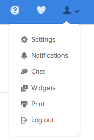
When you log into remind there is a button that you can press called my account. The icon is a silhouette of a person. When you press this icon a drop down bar comes down with different options. You are going to want to click the button widgets.
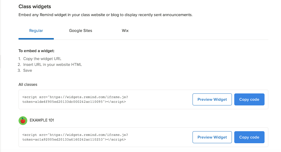
Once you clicked widgets you will be brought to a whole other page where the HTML is located. You are going to want to copy the HTML code so you have it to be pasted onto your edline page.
On this page you have the option to embed all classes but I would suggest just one class per edline page.


-Now on edline go into contents on your edline page.
-Make a new document
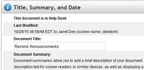
-Make a new file called “remind announcements” or whatever you would like.


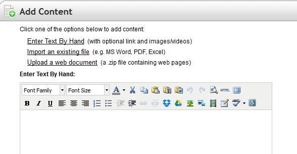
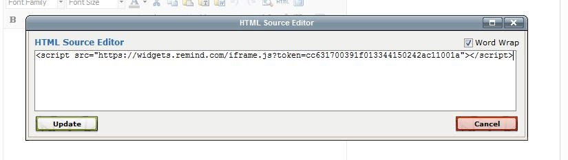
-Go to enter text by hand and that would be where you should past in the HTML code. You need to HTML icon in the document
-Then a new window will pop up and that is where you will be able to copy in the Remind HTML code.
-Once you copy in the code hit update. You will see nothing but that's ok.
-Make sure to save the changes

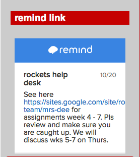
               -The remind will show up in the corner as a clickable link.

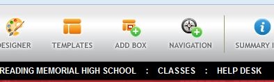
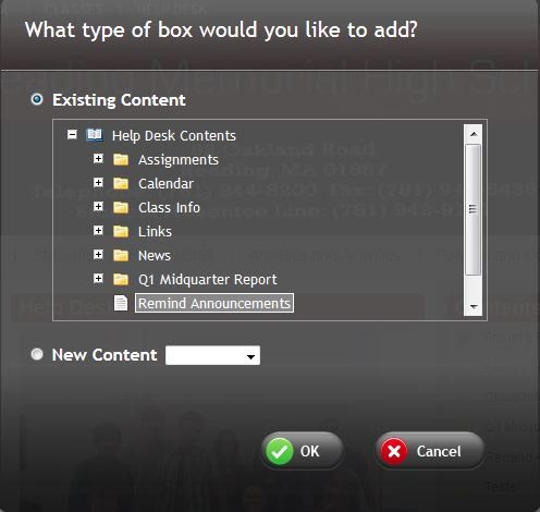
-To make it really appear in the corner go to edit this page and click the “add box button”
-When you add a box you click on the box and the you select remind announcement -Then click “ok” and the remind announcement will show up at the top of the page

-Then grab the box and drag the box to your desired place on the edline page

     -The remind box will look blank
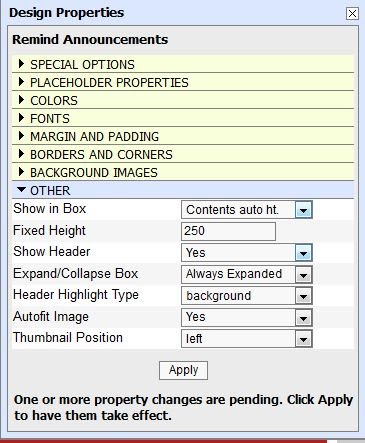
-Go into the setting then design properties wheel of the box and go to the “other" tab. Go to the first line and change from summary to auto height and then click the apply button and then the remind button will finally show up in your box.
-Remember to X out of the property box.
-Save your design
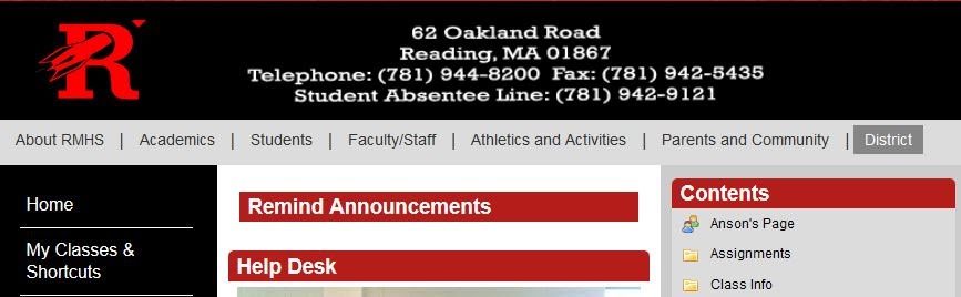
Your finished product should look like the image below


DocScan HD

DocScan HD is an app that focuses on the scanning of all documents with any smart device, even if the document is not perfect. The app instantly allows you to scan multi-page documents and share them, even when there is no scanner nearby. You can shoot not only documents, but whiteboards, receipts, business cards, posters, coupons, books etc. All of this information and more can be found in the presentation as well.


Tech Integration Profile: Ms. Jones

Rockets Help Desk loves to identify when teachers use technology in their classes to benefit their students. This week we are focussing on Ms. Jones, a math teacher at Reading Memorial High School. She is also the Co-Advisor of the class of 2019 and the advisor of the Leo Club. 

Edline is the online tool that RMHS uses to give teachers their own website page for each of their classes. Ms. Jones utilizes Edline to upload class notes, homework assignments, study guides, and various assignments. Below is the transcript of our interview with her. 


RHD: Why did you decide to use Edline?
Ms. Jones: I decided to use Edline because it is a resource that the school district does pay for. Personally, I would prefer using Google Drive but I want to use a resource consistent with my peers and I recognize that this is may be more convenient for the students.


What do you upload to Edline?
I upload grades on a weekly basis, daily notes, weekly homework assignments, study guides, various projects, etc.


How much impact does it have on your teaching?
Edline has a significant impact on how I communicate with my students and their parents outside of the classroom. It allows me to provide resources for struggling students, to easily communicate with parents, and it allows students to have access to classroom material even if they are not in class.


Does using Edline make it easier for you, the teacher?
Edline makes many aspects of my role as a teacher easier. For example, I can assure that students who are absent have access to notes. Also, I can easily communicate with parents using the messaging feature and weekly grade reports. Parents are a vital role in what I do, and it allows more two-way communication between us. And, it works out well when my students lose assignments or forget to write down their homework because it is always available online. This does require more work on my end for certain things, but the results are well worth it!


How have students responded to your use of Edline?
Students LOVE that their grades are available online on a weekly basis and that notes are always available online. Some students did not like when I posted homework on Edline and not in the classroom. They would often forget to check their homework, even though that is their responsibility and it was posted a week in advance. I now post homework on Edline and in the classroom.


Do they like it better?
This would be a great question for one of my students! I am not sure what they have to compare it to. Personally I think Google Drive is more user friendly and more reliable, but it is important to be consistent across the district.


Do they use it?
I would like to think all of my students do, but I know that this is not the case. I think it is safe to say that almost all of my students do.


What happens if Edline doesn't work, if the site crashes? How does it impact you, your students, and your class?
This puts a big damper on my work. But, I generally try to plan ahead and make sure that everything that would need to be online for a week's worth of classes is done a week before. It may delay me from taking attendance or inputting grades, it has caused students to not get their work done, and it has made me assure myself that I always have a backup plan!

When I had Ms. Jones last year for Geometry, I found it super helpful that she uploaded class notes and homework to Edline. It helped me if I was out, and it always gave me easy access to what the homework was.


Here are some screen shots of Ms. Jones' Edline page: